We can’t even imagine a colourless world around us. All our daily necessities are packed in attractive colourful packaging that tempts us to buy even if we do not need it. We can’t even imagine our television without colour. We choose our garments, cars, paints and furniture by colour. Colour of a gem or precious stone also guides a person to overcome obstacles in his life.
Despite being so important and so close to everyone’s day-to-day life, it is not possible to express colour in unique or in a specific language. We remember colour till we look at it. The moment we take away our sight from it, it gets erased from our memory. The colour scientists attempted to specify colour in an explicit universal language so that it could be understood by everyone involved with colour and colour reproduction. This led to express colour numerically which is a unique and unambiguous specification of colour.
Visual Perception of Colour
A light source illuminates the object and is characterised by the energy at different wavelengths, which is denoted by the term spectral power distribution (SPD). When a light beam falls on an object, it is modified by absorption, scattering and other physical processes depending on the physical and chemical construction of the object. The light (colour stimulus) that reaches the eye of the observer in the form of reflected light interacts with the photosensitive pigments present in the eye. This gives rise to nerve impulses which are transmitted to the brain. The human eye-brain mechanism makes a rapid and continuous evaluation of object appearance and colour. The light, which enters our eyes, contains the characteristic imprints of the light source and the object. Light can also fall directly (without interaction with an object) on our eyes creating nerve impulses.
Colour Perception
The Committee on Colorimetry of the Optical Society of America in 1922 defined colour as the general name for all sensations arising from the activity of the retina of the eye and its attached nervous mechanisms, this activity being, in nearly every case in the normal individual, a specific response to radiant energy of certain wavelength and intensity (OSA, 1953).
Colour is sometimes used as a name for materials such as dyes and pigments, but the name Colorant will be more appropriate in these cases. The psychophysical concept of colour as characteristics of light dependant on human vision is most appropriate.
Colour Mixing
According to one reliable estimate, we can distinguish among ten million different colours (Judd and Wyszecki, 1975). Kuehni further estimated that the humans with normal colour vision can distinguish among some two million colours when viewed against a mid-grey background and perhaps double when the background is widely varied (Kuehni, 2005).
Colour perception for humans is three-dimensional, a fact almost certainly stems from the existence in the retina of three different classes of light-receptive cells. LeBlon (1756) was first to make a clear distinction between mixing pigment colours and mixing colours of light. He stated that all visible objects can be represented by three colours, yellow, red and blue and a mixture of these three colours makes black or all other colours. He named those as material colours or those used by painters. He further added that for a mixture of spectral colours those proposed by Sir Isaac Newton cannot produce black, but the very contrary, white.
Primary colours are sets of colours that can be combined to make a useful range of colours. For human applications, three primary colours are usually used, since human colour vision is trichromatic.
Fundamental laws of colour mixing can, therefore, be classified into two types (Figure 1) namely
- Additive colour mixing occurs when two or more lights mix together.
- Subtractive colour mixing occurs when colourants are mixed together.
Virtually all our visible colours can be produced by utilizing some combination of the three primary colours, either by additive or subtractive processes.

For additive combination of colours, as in overlapping projected lights or in CRT displays, the primary colours normally used are red (R), green (G), and blue (B). The result of additive mixing of the primaries are listed below,
- R + G = Y (Yellow)
- G + B = C (Cyan or blue-green)
- B + R = M (Magenta)
- R + G + B = W (white)
For subtractive combination of colours, as in mixing of pigments or dyes, such as in dyeing or printing, the primaries normally used are cyan (C), magenta (M), and yellow (Y), though the set of red, yellow, blue is popular among artists.
The subtractive primaries can be obtained by removing red, green and blue from white light using respective coloured filters namely
- W – R = C (- R)
- W – G = M (- G)
- W – B = Y (- B)
The mixing of subtractive primaries yellow, magenta and cyan can be predicted mathematically as follows:
- Y + M = (W – B) + (W – G) = W – B – G = R
- Y + C = (W – B) + (W – R) = W – B – R = G
- M+ C = (W – G) + (W – R) = W – G – R = B
- Y + M + C = W – R – G – B = K (Black)
When the three subtractive primaries are mixed in proper proportions as in case of mixing colourants, the mixture is unable to reflect light any more and appear black (K) in colour. Similarly, when white light is passed through filters of three subtractive colours, the whole of white light will be removed. The mixture of two primaries is called secondary. The most commonly used additive colour primaries are the secondary colours of the most commonly used subtractive colour primaries, and vice versa.
The age-old belief that three primary colours are required to make white was also proved false (Helmholtz, 1852). The idea of complimentary spectral colours came into existence and was subsequently defined by Grassman (1853) as follows:
To every colour belongs to another homogeneous colour, which when mixed with it, gives colourless light.
Subsequently, Helmholtz confirmed that every spectral colour does not have a spectral complement as proposed by Grassman. A range of green colours ranging from about 484 nm to about 570 nm, has complimentary colours in the non-spectral purple range.
Colour Communication
In colourant production and application industries, colours are to be communicated, compared, recorded and formulated on a regular basis. This necessitates systematic classification of colours. The objects can be classified in various ways in terms of colour. The classification may be based on visually or instrumentally-assessed colour parameters (Roy Choudhury, 2000).
While communicating or talking about colour, a language which is understandable by both the parties must be followed. A logical scheme for ordering and specifying colours on the basis of some clearly defined attributes is known as a colour notation system. The attributes are generally three in number as our vision is trichromatic and they constitute the coordinates of the resultant ‘colour space’. Colour notation systems also encompass ‘colour order systems’ which are typically comprised of material standards in the form of a colour atlas. Due to constraints of colourant gamut, the atlases may depict only a physically realisable subset of a colour order system.
For instrumental colour measurement of an object, additive primaries are used to predict the number of subtractive colours required to reproduce that colour. This entails the use of a standard source of light, viewing geometry and a standard observer. The expression of colour as numerals has been standardized by Commission Internationale de l’Eclairage (CIE) set up in 1931 for standardisation of measurement of colour. Thus the instrumental measurement of colour is helpful in, communication of colour across the entire supply chain as well as comparing samples and setting a pass-fail criterion for sourcing and supply of products. In this form, it is a useful tool for quality control.
It is very convenient, easily understandable and memorable when the colours are called by names similar to common objects orange, ultramarine, olive, malachite green, bottle-green, peanut-green, sea-green etc. But such colour names are very approximate, unreliable and temporary. Their meaning also changes with the observer, time, place, style, technology, language, culture etc.
When we deal with a reasonable number of a specimen, say a few thousands, to cover the whole range of possible colours (1millions or more), the specimen must be selected according to a system or plan. It is well known that the colours are three-dimensional. However, the dimensions of colour are expressed in various ways in different fields. For systematic arrangements, the dimensions should be independent of each other.
Visual Description of Colour
A colour order system is a systematic and rational method of arranging all possible colours or subsets by means of material samples. Once the colours are arranged systematically they are named in some descriptive terms and/or are numbered (Graham, 1985).
The colour order systems are of three types (Wyszecki, 1986):
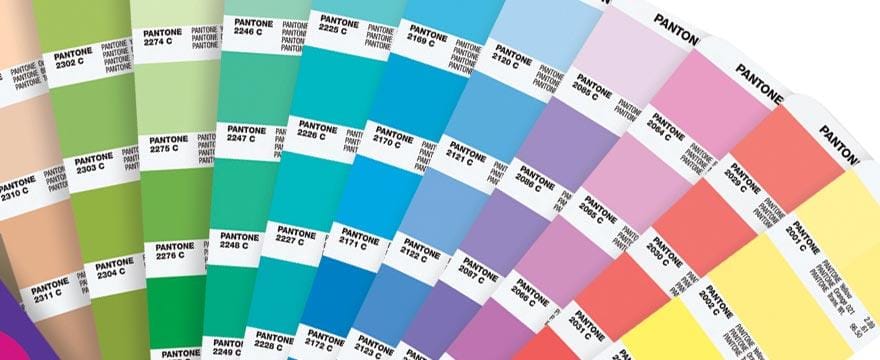
- The colourant-mixture system based on a subtractive mixture of colourants e.g. Pantone (Figure 2)
- The colour-mixture system based on an additive mixture of colour stimuli e.g. Ostwald system.
- Colour appearance system based on the principles of colour perception or colour appearance e.g. Munsell (Figure 3).
Examples of colourant-mixture systems are the colour atlases developed by different dye manufacturers. ICI colour atlas (1969) was a collection of 1379 original colours and 27,580 variations printed on papers.
Pantone Colour Matching System (Figure 2) is basically a colourant mixture system. The Pantone system (www.pantone.co.uk) began life in 1963 in the USA, for defining colours for printers, but expanded into other fields later, e.g. textiles in 1984, plastics in 1993, and architecture and interiors (1925 colours) in 2002, each of which has a 6-digit numerical notation (e.g. # 19-1764) and an inspirational colour name. This is widely used in graphic art and also in the textile industry mainly because of its low cost, though the colours are not equally spaced. The shades are prepared on paper using printing inks. It is not a colour order system since it does not include a continuous scale. It is more appropriately considered a colour naming system.
Colour appearance systems are based on the perception of colours by an observer with normal colour vision. The scales of these systems are chosen to represent attributes of perceived colours. However, attributes represented in various systems are different.
The main emphasis of appearance-based systems is the uniform visual spacing. The systems thus allow easy interpolation between the samples represented and extrapolation of colours not illustrated in a given collection. The collections of samples are generally represented in pages of constant hue.
Six popular colour order systems, country of origin and their respective colour attributes are as follows (Roy Choudhury, 2010) :
- Munsell (USA) – Hue, Value and Chroma
- Natural Colour System (Sweden) – Hue, Blackness and Chromaticness
- Ostwald system (Germany) – Hue, Lightness and Saturation
- DIN system (Germany) – Hue, Saturation degree and Darkness degree
- OSA-UCS (USA) – no separate scaling of three attributes
- Coloroid System (Hungary) – Hue, Saturation and Lightness.
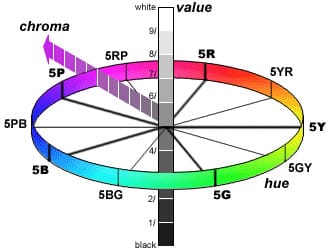
Most popular appearance-based colour order system is the Munsell system. The system (Figure 3) consists of the following three independent dimensions which can be represented cylindrically in three dimensions as an irregular colour solid.
- Hue (H), measured along the circumference of the horizontal circles
- Chroma (C) or purity of colour, measured radially outward from the neutral (grey) vertical axis
- Value (V), measured vertically from 0 (black) to 10 (white).
The complete Munsell specification of a sample is expressed as H V/C (e.g. 5R 4/8).
Munsell system divides each horizontal hue circle into five unique or principal hues: Red (5R), Yellow (5Y), Green (5G), Blue (5B), and Purple (5P), along with 5 intermediate hues (5YR, 5GY, 5BG, 5PB, 5RP) halfway between adjacent principal hues.

The Munsell atlas is usually available on painted paper in glossy (1488 chips) and matt forms (1277 chips). A method for specifying opaque object colours such as textiles, painted panel etc. by Munsell colour system has been described by ASTM (1980).
SCOTDIC, a textile version of Munsell created by a fusion of two quite different systems – Standard Colour of Textile (Japan) and Dictionnaire Internationale de la Couleur (France), is adopted by over 8,000 companies worldwide.
Most of the material based atlases are now available in digitised form e.g. NCS Digital Atlas (www.ncscolour.com), Digital Colour Atlas 3.0 (www. dtpstudio.de) etc.
Instrumental Measurement of Colour
Newton said that (light) rays are not coloured, but merely has the power to simulate certain sensations in the mind of the observer. The human eye is a highly versatile detector of light and colour. An observer can perceive chromatic attributes and various geometric factors (direction, texture, shape and many others) simultaneously. An instrument till date is far behind in versatility. It can measure only one attribute at a time. In other words, we need several instruments to measure various aspect of visual perception.
Basically, there are three types of colourimetric instruments in use – colourimeter, spectrophotometer and spectroradiometer. They are available in the market with varying degrees of sophistication and specialisation. While the spectroradiometer measures in illuminant-mode, the other two generally measure in object mode. The recent trend on instrumental process control has resulted in the use of on-line instruments. However, a majority of the colourimetric instruments till date are off-line and mostly used in laboratories. Laboratory instruments should be highly accurate and standardised, while on-line instruments should be rugged under various environments and should have good precision and firmness.
The colourimeters measure colour in terms of the quantities of the three primaries required to match the colour. On the other hand, spectrophotometer measures per cent reflectance or transmittance of the object plotted against wavelength at regular intervals of 1 nm, 5 nm, 10 nm, 20 nm throughout the visible range of light i.e. 380-750 nm or for practical purposes 400-700 nm.
Colour by Numbers!
The colour of an object depends on the relative quantity of the light reflected at different wavelengths within the visible range (400-700 nm), but our colour sensation is not analytical in nature. We cannot judge the existence of lights of different wavelengths individually. We get the sensation from cumulative effect. As this cumulative quantity can be matched by mixing three primary lights it is proved that our eyes have three types of colour-detecting cones, the stimuli generated by them are mixed before reaching to the brain. Various other phenomena of colour have also lead to the conclusion that our eyes have three types of cones only. Each object colour is sensed by each type of cone separately and each type sends a stimulus to the brain.
So, for each object colour, the brain receives three separate stimuli. Keeping similarity with colour mixing experiment, we can consider the three types of cones as red-sensitive r, green-sensitive g and blue-sensitive b equivalent to the three additive primaries. The spectral sensitivity of the three colour-detecting cones has been measured and named as colour matching data ![]() (bar stands for statistical average data of a number of colour normal observers) and subsequently transformed into more usable CIE standard observer functions,
(bar stands for statistical average data of a number of colour normal observers) and subsequently transformed into more usable CIE standard observer functions, ![]() The area under the functions signifies the amounts of three stimuli to be transmitted to the brain for the incidence of light having one unit of energy at each visible wavelength. These three stimuli are represented by three numbers called CIE tristimulus values (X, Y, Z) which may be calculated as follows:
The area under the functions signifies the amounts of three stimuli to be transmitted to the brain for the incidence of light having one unit of energy at each visible wavelength. These three stimuli are represented by three numbers called CIE tristimulus values (X, Y, Z) which may be calculated as follows:
Where E(λ) is the relative spectral energy distribution of the illuminant, R(λ) is the spectral reflectance factor of the object and ![]() are the colour matching functions of the CIE standard observer. K is a normalising constant.
are the colour matching functions of the CIE standard observer. K is a normalising constant.
A light source is an essential component of visualisation and measurement of colour. Various light sources, such as daylight (D65), tungsten lamp (A), fluorescent lamp (F1 to F12), departmental lamp (TL84) etc., emit different amounts of energy in the visible region of the spectrum that can be expressed in the form of its relative spectral power distribution (SPD) curve. An illuminant is an ideal form of a light source with defined SPD. The SPD of a light source may vary, but that of the illuminant is constant or defined and hence, it is used for quantification of colour as mentioned above.
Where E(λ) is the relative spectral energy distribution of the illuminant, R(λ) is the spectral reflectance factor of the object and are the colour matching functions of the CIE standard observer. K is a normalising constant.
In the visual observing situation, the observer is the human eye that receives the light reflected from or transmitted through an object and the brain which perceives the vision. Since different human perceives colour in different ways, subjectively, attempts have been made to standardise the human observer as a numerical representation of what the average person sees. This standard observer could then be used in lieu of a human observer when assessments are made instrumentally. In 1931 CIE published the 2° CIE Standard Observer function based on colour matching by viewing through a hole of 2° field of view. Later it came to know that cones present in a larger area of the eye. Hence, in 1964, the 10° Standard Observer function was developed which is now universally used.
When two objects have equal tristimulus values under a particular illuminant, they will look alike in colour under the said illuminant. If their reflectance curves are same they will look alike in colour under any illuminant (universal match). Otherwise, they may or may not differ in colour when the illuminant is changed. On the other hand, two alike colours with different lightness may have different tristimulus values. To express colours in two-dimensional space independent of lightness, chromaticity coordinates may be calculated as follows:
![]()
As x + y + z = 1, only two chromaticity coordinates ‘x’ and ‘y’ have been recommended by CIE to specify chromaticity. Instead of tristimulus values (X, Y, Z), colours can also be specified by a luminance parameter Y and two colour coordinates x and y (Yxy colour space).
However, none of the chromaticity coordinates is correlated with any meaningful visual attribute of colour.
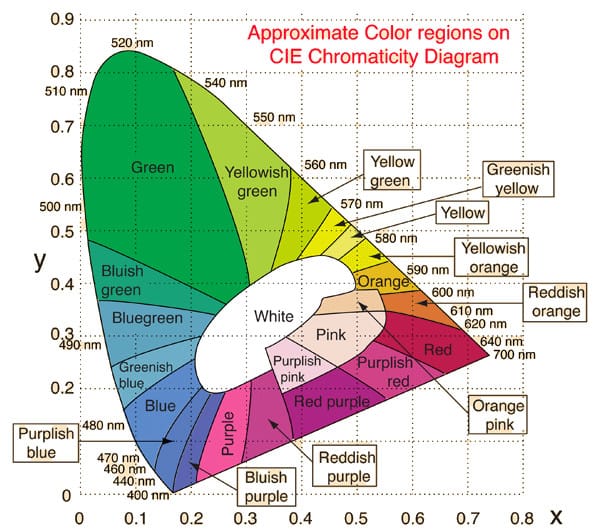
When the chromaticity coordinates of spectral colours are plotted in such diagram, a horse-shoe shaped curve called chromaticity diagram is obtained. Chromaticity diagram is of great help in finding colours generated by additive colour mixing. If two lights are represented by two points on the chromaticity diagram, any additive mixture of the two will correspond to a point on the straight line joining the two points. Since the locus of spectral colours is concave, all real colours must fall within the area bounded by the spectrum locus and joining the ends.
Figure 4 shows chromaticity diagram along with the location of different spectral colours (i.e. monochromatic lights of different wavelengths). The figure also shows the regions of locations of different surface colours viewed under daylight. Approximately in the centre of the curve is the neutral point, which represents the chromaticities of white, grey or blacks. The illuminant C having chromaticity co-ordinates x = 0.310 and y = 0.317 also lies at the centre of the curve (point C). The locations of other illuminants depend on their colour temperatures. The chromaticity diagram is closed by a line indicating the locations of non-spectral purple colours.
CIE system is very successful for colour specification and is universally used for colour measurement. The system is unchanged since 1931 except some minor change in 1964. CIE tristimulus values are related only to the colour. It ignores all other aspects like surface texture, gloss etc. which influence colour appearance significantly. It does not take into account geometrical arrangements for illumination and viewing and the instrumental measures will match visual assessments only if the above geometries are similar.
The main limitation of the CIE system is its visual non-uniformity. Equal changes in Yxy colour space do not correspond to equal colour perception. In other words, the distribution of colours in CIE colour space is non-uniform with regard to visual perception.
Uniform Colour Scales
CIE tristimulus values or chromaticity coordinates are not very convenient for identifying the colour of the objects, because these were designed for colour stimuli of different modes. None of the values is directly correlated with any visual attributes of colour. Only Y value has a high correlation with luminance and object lightness. The spacing of colours in the chromaticity diagram is not visible uniform. A number of uniform colour scales are, therefore, developed which can represent colours with equal visual spacing and are directly related to meaningful attributes of colour appearance.
In 1976 CIE recommended CIELUV and CIELAB uniform colour spaces. Colourant industries were in favour of a formula similar to Adam-Nickerson (AN40) formula, popular at that time. The CIELAB formula was acceptable as colour-difference values were about 1.1 times those produced by AN40 formula. On the other hand, television industries preferred a colour space (CIELUV) associated with a chromaticity diagram because of its simple way of presentation of the additive mixture which also occurs in television and other display devices. No simple relation exists between the two colour scales.
Both CIELUV and CIELAB formulae are plotted on rectangular coordinates. Lightness L* function is the same for both colour spaces and is represented by the formula, L* = 116(Y/Yn)1/3 – 16 if Y/Yn = 0.008856
For CIELAB Colour Space, Red-green attribute, a* = 500[f(X/Xn) – f(Y/Yn)]
Yellow-blue attribute, b* = 200[f(Y/Yn) – f(Z/Zn)]
Subscript n represent nominally white object colour stimulus given by a perfect reflecting diffuser as reference surface illuminated by standard illuminant. For standard daylight illuminant D65, the values are: Xn = 95.047, Yn = 100.000, Zn =108.883. The white object has been taken into account because we perceive colours in relation to surrounding colours.
In recent years efforts have been made to define CIE correlates for perceptual attributes like lightness, chroma and hue. Hence, two new attributes corresponding to visual attributes have been derived from a* and b* values namely:
Metric chroma, C*ab = [(a*)2 + (b*)2] 1/2
Hue angle, h = tan -1 (b*/a*).
CIELAB colour space is shown in Figure 5. Lightness L* is represented in vertical axis with white (L* = 100) at the top and black (L* = 0) at the bottom. Chromatic colours are represented by two opponent a* and b* axes. Red and green are represented by a* axis – the positive values are for red and negative for green. Similarly, positive b* values are for yellow and negative b* values are blue.

Colour Difference
Measurement of difference in colour between two objects is one of the most complicated aspects of colour vision. The colour discrimination may be general/overall or of a specific psychophysical attribute like hue, chroma or lightness. For colourant users like textile, leather, paper or paint industries, the difference in colour of two specimens namely a standard and a sample or of different portions of a coloured specimen may be more important than the measurement of absolute colour (Luo, 1986). The prime difficulty is that the perception of colour-difference by an individual is not a precise phenomenon and may vary on successive assessment (Zeller and Hemmendinger, 1978). Colour-difference perception and evaluation may also vary widely among individuals.
The colour-difference evaluation is necessary for day to day colour control and for colour matching in colouration industries like textile, paint etc. Colour-difference formulae have accelerated the instrumental pass-fail device a success.
The colour differences are calculated by subtracting values of the standard from the respective values of the sample.
The total colour-difference (ΔE) is intended to be single number metric for pass/fail decisions and in the CIELAB system ΔE is given by the following equation:
ΔE = [ (ΔL*)² + (Δa*)² + (Δb*)² ]1/2
In addition to the overall colour difference (ΔE), the difference in individual parameters of the standard and a sample are also estimated e.g. ΔL = L (sample) – L (standard).
These may indicate some specific visual difference such as
if ΔL < 0 or > 0, the sample is darker or lighter respectively,
if Δa* < 0 or > 0, the sample is greener or redder respectively,
if Δb* < 0 or > 0, the sample is bluer or yellower respectively.
ΔE (CIELAB) values are not always reliable in predicting perceptible differences between object colours, especially when the variations are in different visual attributes. This is due to the fact that the visual spacing along L, a* and b* axes are unequal.
The formulae based on surface-mode colour discrimination data mainly aimed at single number shade-passing. Much of the available visual data related to physical samples are supplied by the textile and dye industries, where prime criteria are whether the colours will be acceptable against the respective standards.
The main reason for poor correlation with visual data of the earlier formulae was an equal weighting of the colour parameters. The weighted values of lightness, chroma and hue showed significant improvement in the performance of colour-difference equations. The weights can be determined by empirical fitting to experimental data-sets. These formulae are optimized by visual acceptability/ perceptibility scaling. They represent most closely the average visual results of judgments of the colour difference of textile and other physical samples under normal evaluation conditions (Kuehni, 1984)
A few colour-difference formulae based on surface-mode colour discrimination data are:
- JPC79 colour-difference Formula
- CMC (l:c) colour-difference Formula
- BFD (l:c) colour-difference Formula
- CIE 94 colour-difference Formula
- CIE 2000 colour-difference Formula
However, none of the above formulae is completely satisfactory and acceptability of a particular formula is decided mutually by producers and users/sellers.
Colourimetry is the science of quantitative measurement of colour. Even though study on colour science started as far back as the Newtonian age, research continues even today. Colour Science is a vast field. Hunt (1977) identified three phases of development of colourimetry – colour matching, colour difference evaluation and lastly, prediction of colour appearance. It is now possible to predict the colour appearance of an object under a test illuminant from the colour appearance data under a reference illuminant with the help of complex mathematical transformations.
References
- Judd D.B. and Wyszecki G. (1975). Color in business, science and industry, 3rd Ed., John Wiley & sons, New York, p388.
- Kuehni R. G. (1984). Colour Technology in the Textile Industry, AATCC, U.S.A., pp.123.
- Kuehni R. G. (2005), Colour: an introduction to practice and principles, New Jersey, Wiley-Interscience.
- Leblon C. Jacob (1756). Coloritto or the harmony of colouring in painting, English and French
- Edition reprinted in Paris.
- Luo M.R. (1986). New Colour Difference Formula for Surface Colours, Ph.D Thesis, University of
- Bradford, Bradford, U.K.
- Jordan G. and Mollon J. D. (1993). A Study of Women Heterozygous for Colour Deficiencies, Vision Research Vol. 33, No. I I, pp. 1495-1508.
- Optical society of America (OSA) (1953). The science of color, Committee on Colorimetry, Thomas Y. Cromwell, New York.
- Roy Choudhury A.K. (2000). Modern concepts of colour and appearance, Science publishers (USA) and Oxford & IBH, New Delhi,.
- Roy Choudhury A.K. (2010). Chapter 2. Scales for communicating colour in Colour Measurement: Principles, advances and industrial applications. Edited by M L Gulrajani, Woodhead Publishing Series in Textiles No. 103, ISBN 1 84569 559 3.
- Wyszecki G (1986), Colour Appearance, Chapter 9 in Handbook of Perception and Human Performance, New York, Wiley.
- Zeller R.C. and Hemmendinger H. (1978). Evaluation of Color-difference equations: a new approach, AIC Color 77, Bristol: Adam Hilger.